Overview
My Gym Buddy is an app designed to enhance the gym experience for new members by empowering them and fostering belief in their fitness journey. This results in a positive and engaging first experience.
Drawing from my personal experience at a local gym, I noticed a significant gap between trainees and trainers. This gap, characterized by a lack of trust and confidence, often hinders progress. The primary goal of this app is to bridge this gap.
Background
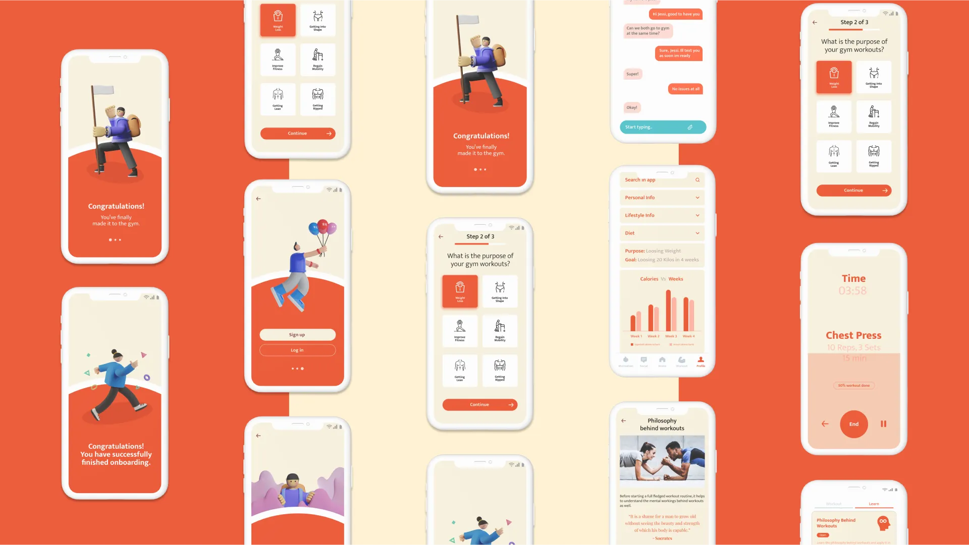
Before starting my fitness journey, I led a sedentary and indulgent lifestyle. This caught up with me during a planned trek, prompting me to join a gym and work on my health. To reflect this milestone, the app’s onboarding begins with: “Congratulations! You’ve finally made it to the gym.”
Unfortunately, my first gym experience was disappointing.
Problem Statement
From my own and others’ experiences, I identified several key problems:
- Lack of a proper onboarding process for users.
- Inadequate workout instructions.
- Users losing motivation during training.
- Knowledge gaps between users and trainers.
- Inability to effectively track progress.
Goals
The app aims to:
- Reduce reliance on trainers for basic tasks, allowing them to focus on critical guidance.
- Ensure users depend on the app for workout knowledge, instructions & motivation.
Success is defined by positive responses to user surveys conducted during prototype testing.
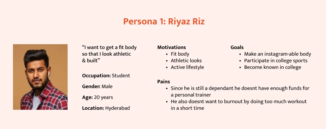
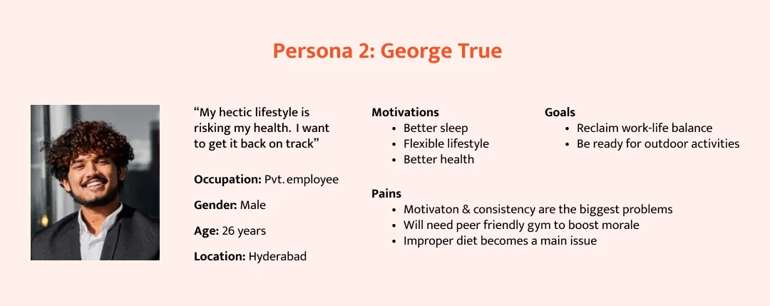
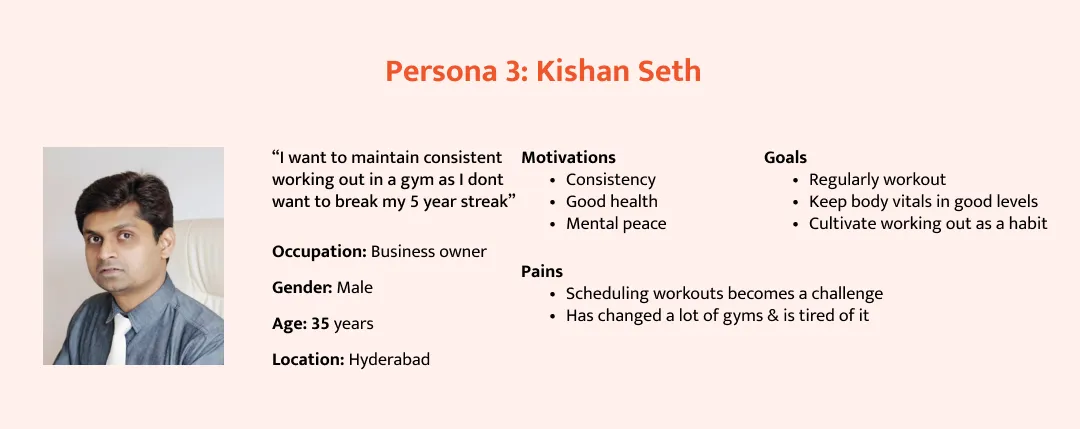
User Personas
Three personas representing typical gym-goers were created based on research. These include profiles for Riyaz, George, and Kishan, each with unique needs and habits.
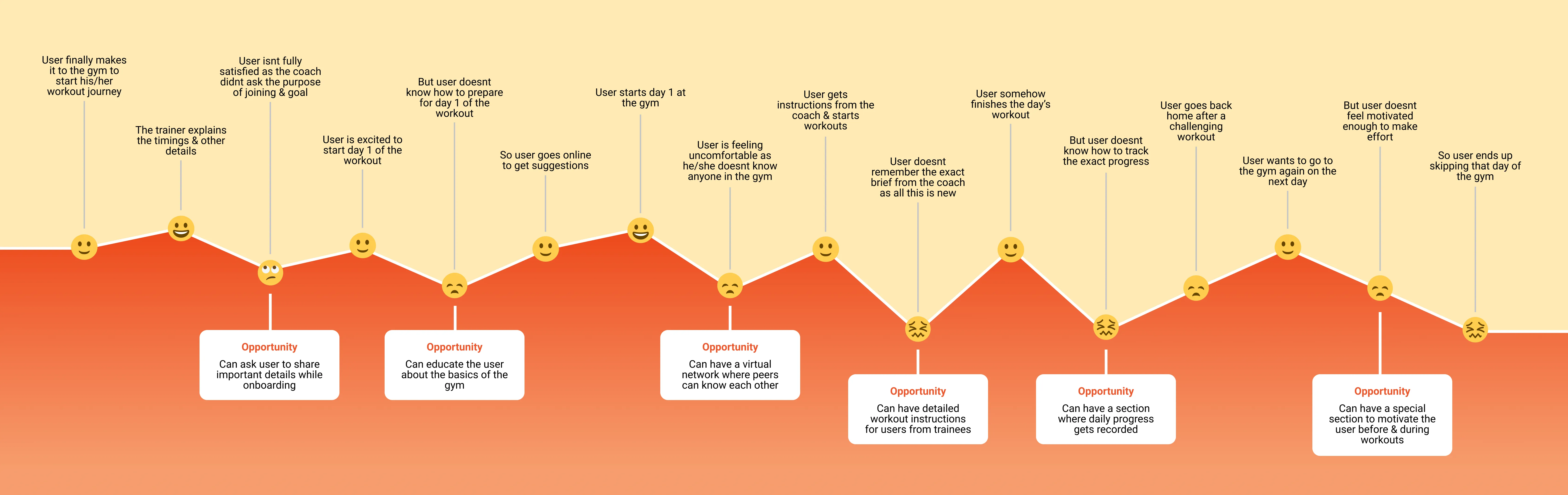
User Journey Map
A journey map was created to visualize users’ interactions with the app, identifying pain points and opportunities.
Competitor Research
Qualitative research on competitors’ apps highlighted the following insights:
-
Most apps lack a dedicated motivation feature, assuming users are already motivated.
-
Social media features are often irrelevant to gym users.
-
Onboarding is not a standard industry practice.
-
Competitor apps prioritize functionality over aesthetics.
-
Some apps have overly complex information architectures.
Learnings
-
Most apps didn’t have a dedicated feature for motivation; the assumption here is that the trainee is already motivated to start the workout
-
The social media feature in most competitors is not relevant to the user
-
Having an onboarding process isn’t a standard industry practice
-
The UI of the competitor apps are based more towards functionality rather than aesthetics
-
The information architecture of a few apps was complex as they had many features
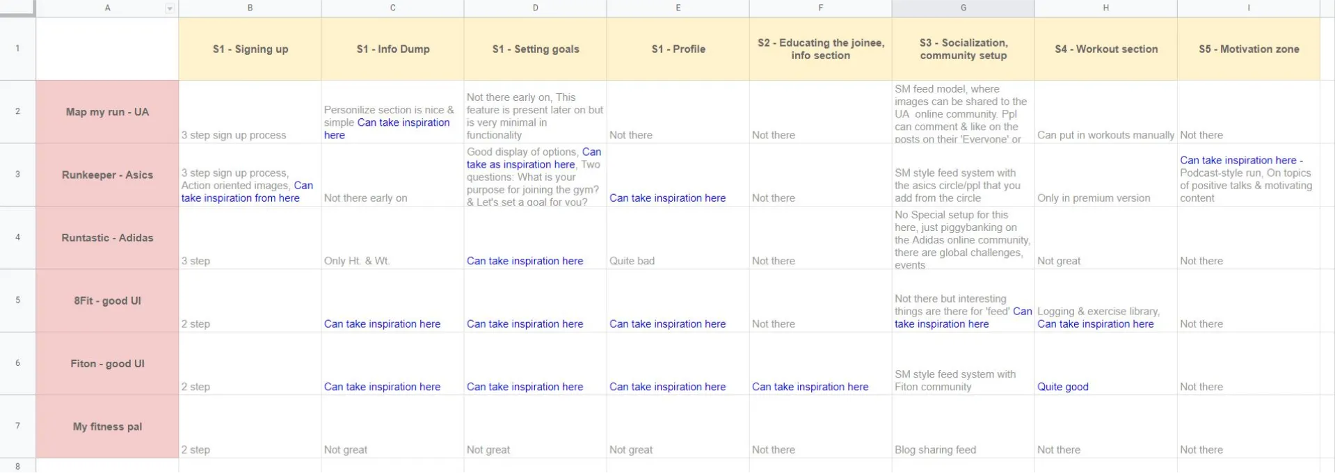
To make competitor research more efficient, I’ve categorized each app based on different experiences that they have for the user & then separated the ones that had a unique approach.
Solution
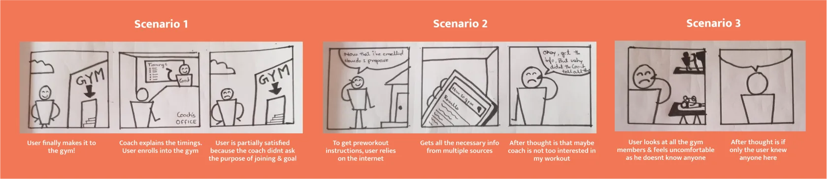
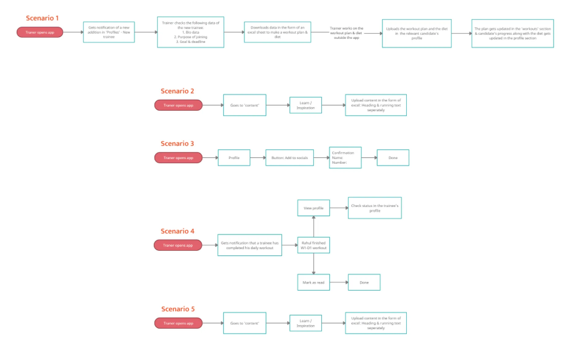
To address identified problems, I designed scenarios reflecting key user experiences:
-
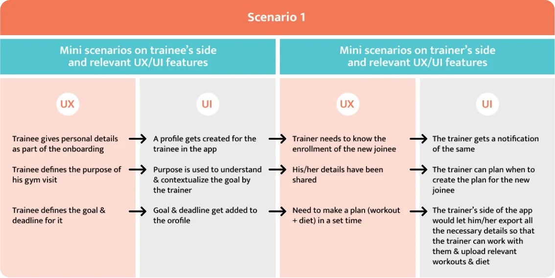
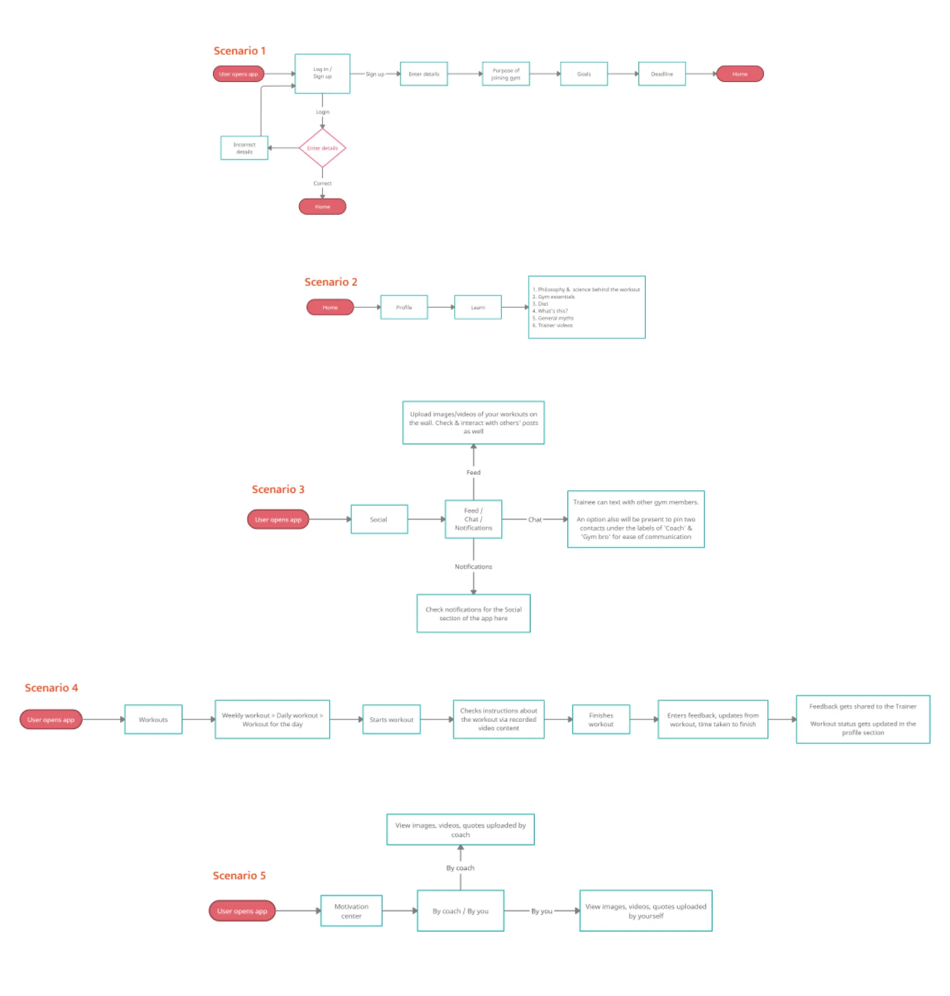
Scenario 1: Getting enrolled
-
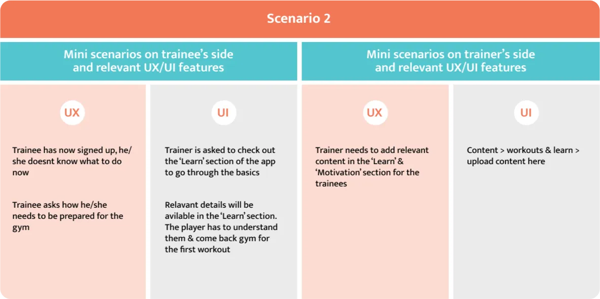
Scenario 2: Preparing for the first workout.
-
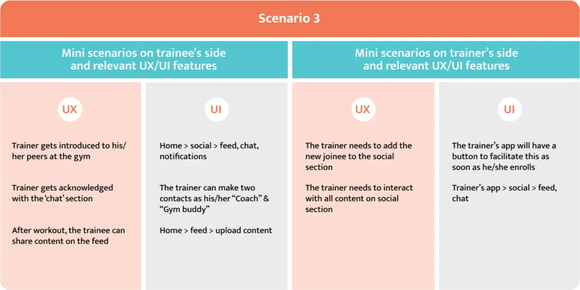
Scenario 3: Connecting with peers.
-
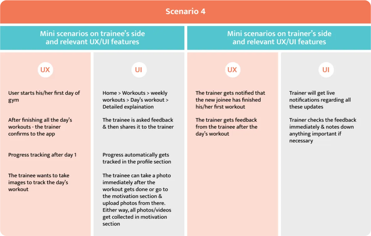
Scenario 4: Completing the first workout.
-
Scenario 5: Tracking progress and finding inspiration.
I used these scenarios & the problem points as guiding direction & started creating different features of the app.

Pipette Funnel Method
I came up with a method where I outlined ideal user experiences and derived app features to fulfill these scenarios in both the trainee and trainer apps.
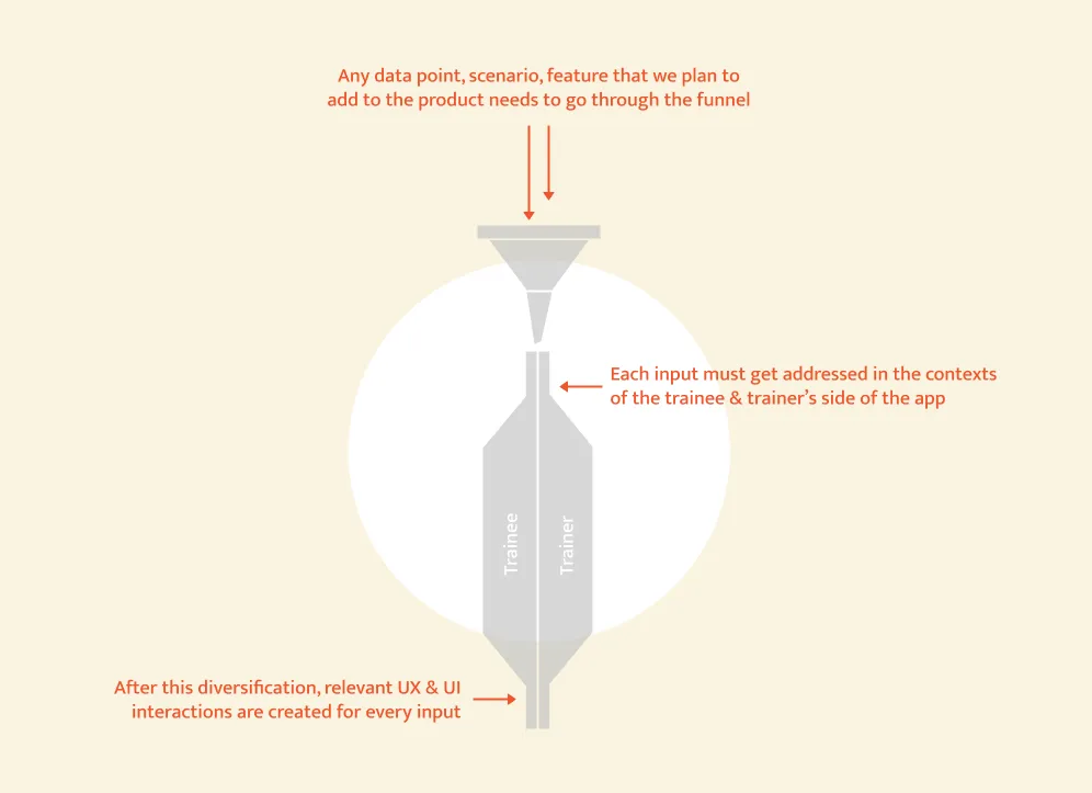
Key Features
After using the above process, I’ve understood the kind of features needed to handle the five scenarios successfully (such that the user feels satisfied & happy).
User onboarding Users input necessary details, which trainers review to create personalized workout and diet plans.
Specific workout instructions Detailed resources like infographics, images, and videos for daily workouts.
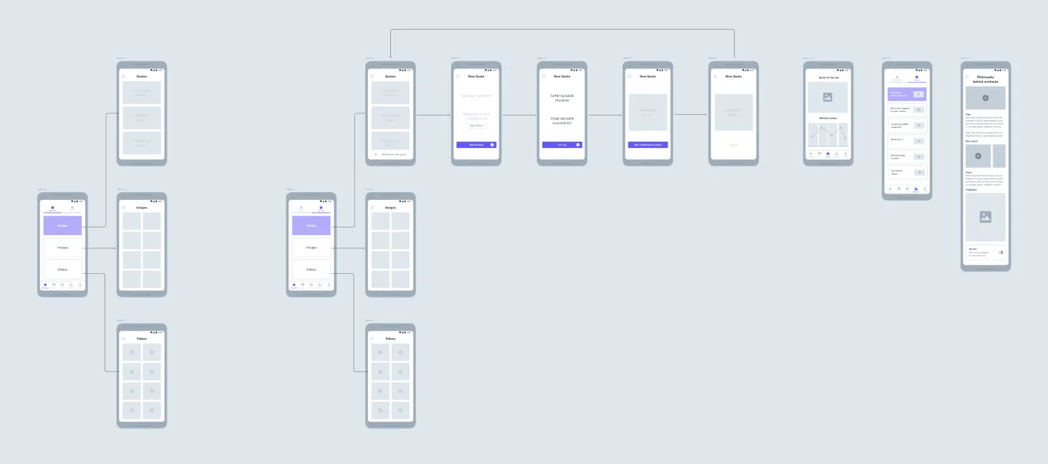
Learning section Comprehensive knowledge base for workouts via videos, infographics, and other media.
Social section Facilitates interaction among gym members and trainers with chat functionality.
Motivation section Includes past workout images/videos and motivational quotes to keep users inspired.
Information Architecture
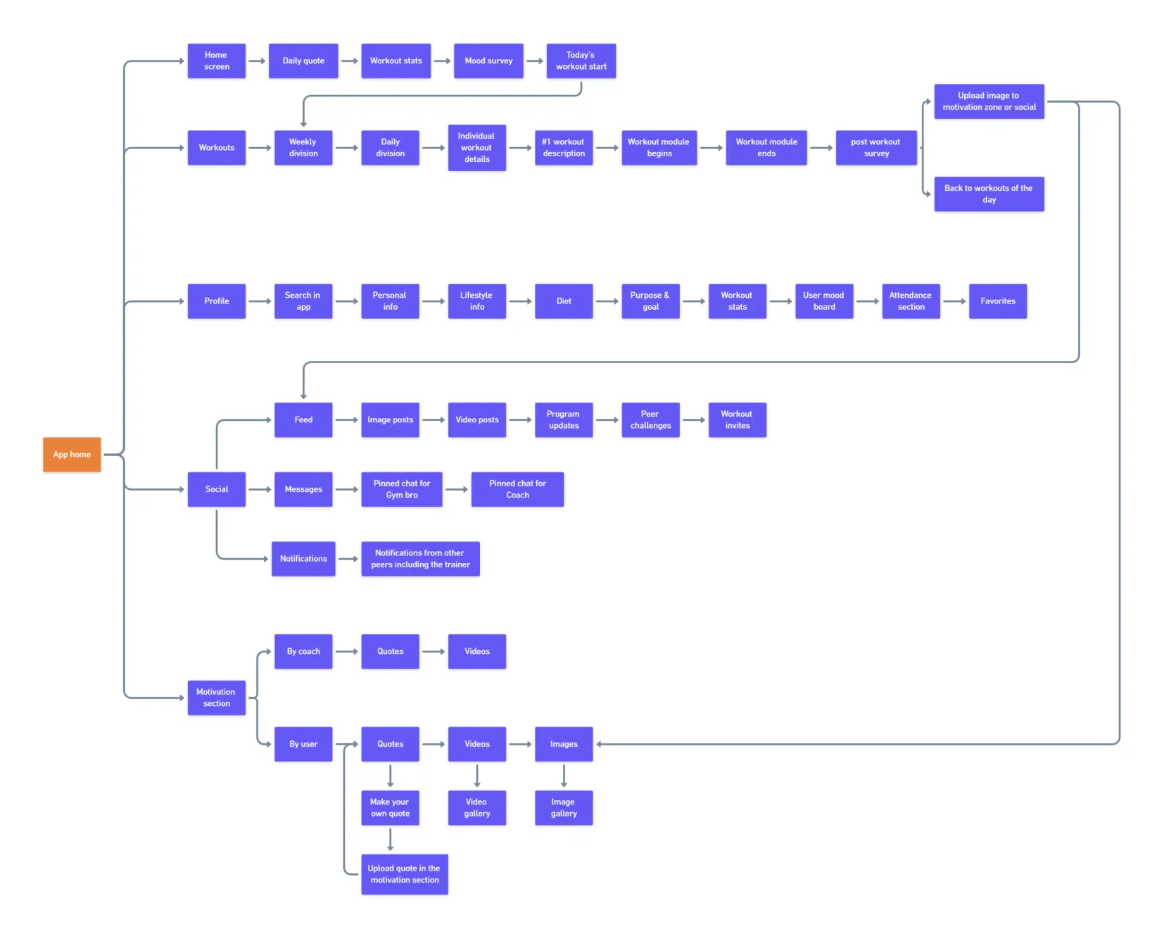
User Flows (Trainee App)
User Flows (Trainer App)
Wireframes
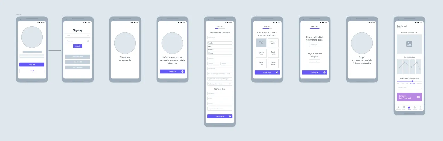
Trinee App Prototype
Trainer App Prototype
Product Testing
What to test? — Is ‘My Gym Buddy’ successfull in enabling users feel more empowered, educated and confident in the gym?
Goals
- Test the app’s ability to replace trainers for basic gym tasks.
- Evaluate user empowerment, motivation, and confidence.
- Determine if users can rely on the app for workouts and progress tracking.
Test Plan
| Where | At the gym where the participants regularly workout |
| When | Just after the session ends. Most participants wouldnt want to take the test midway as it takes a good amount of time |
| Duration | 45 min per user, Split: Demographic survey = 5 min, Product test = 30 min & Post test feedback = 10 min |
| Users | 5 participants tested the product. User selection criteria: 19-35 yrs old, Smartphone users, regular gym goers & new joinees |
| Tools | Google forms, Notes, Figma prototype in my mobile phone |
Test Structure
The entire test is divided into three parts:
Before the test
Participants completed a demographic form and received an app overview.
During the test
Participants:
-
Completed onboarding.
-
Explored the Learn and Workout sections.
-
Used features like social, chat, and notifications.
I explained the app’s functionality throughout.
After the test
Participants filled out a feedback form and engaged in candid discussions about their experiences.
Reviews
-
Smooth navigation and user-friendly UI.
-
Well-designed workout section with timers and live screens.
-
Videos & quotes are very helpful
-
The learn section is useful for pre-workout knowledge
Feedback
-
Program update post (Lean Mean Machine — program update) in feed can be pushed to notifications
-
Workout invites (Sam & Jessi…Metaverse) in feed can be pushed to notifications
-
Include a tutorial video post-onboarding.
-
The content in the ‘Learn’ section is a bit lengthy
-
While onboarding, one of the participants wanted to select multiple options in ‘the purpose of the gym visit page’. This feature could be worked on later.
Proof of success
All participants answered “Yes” to the following:
- Q1: Will you use this app as a substitute for your trainer?
- Q2: Will you rely on this app for motivation, learning & workout instructions?
Future Opportunities
-
Enhanced motivation features focusing on mental health.
-
Support for multi-gym chains.
-
Home workout capabilities.
-
Integration with meditation and fitness tracking apps.
-
Features like live workout tracking, emoji-based feedback, and AI-driven recommendations.
Learnings
-
There are more aspects to working out than visiting the gym, lifting weights & doing cardio. Some of these aspects are: Motivation, education, peer support, feedback check & intelligible progress updates.
-
Choosing a comprehensive approach successfully helped me bridge the gap (mentioned earlier) between the trainer & the trainee.
-
More transparency = exchange of feedback between user & trainer = More trust = User feels empowered = User achieves results sooner = User loves the app
-
Initially following all the predefined stages of the UX design process (problem statement, user scenarios, testing, wireframing…etc.) will be overwhelming but I’ve realized that once I went by the process — stage by stage — I started to slowly trust the process & go with the flow as it all started to make sense with every stage. I felt really happy with this learning personally.
Final Thoughts
I think this product has really good market potential. It can be scaled up to different platforms with more insights from the users.
The trainer’s app requires a tailored approach to prioritize their unique needs. With ongoing user feedback, the app can evolve into an indispensable fitness tool.
Future Possibilities
I spent a lot of time thinking about this app and because of it I came up with so many application scenarios for it. To check them out head to my behance project where I list them out at the end.
Thank you for reading till the end!